Min’s Test Kitchen
MIN’S TEST KITCHEN waS THE FIRST LIMITED TIME POP-UP LOCATED AT WYNN LAS VEGAS. WITH FARE FROM CHEF MIN KIM, THE POP-UP experience WEAVEd KIM’S MANY CULTURAL BACKGROUNDS AND
STREET-STYLE INFLUENCES INTO A COLORFUL NEW CONCEPT.

LOGO + GRAPHIC ELEMENTS
The logo pulls inspiration from an early Japanese art style called ukiyo-e. On works within this genre, an artist’s signature is represented by a woodblock seal stamped onto the piece. These unique seals are a direct representation of the artist. In his chosen medium of cuisine, Chef Min showcases his artistry on the plate, with this logo acting as his stamp.
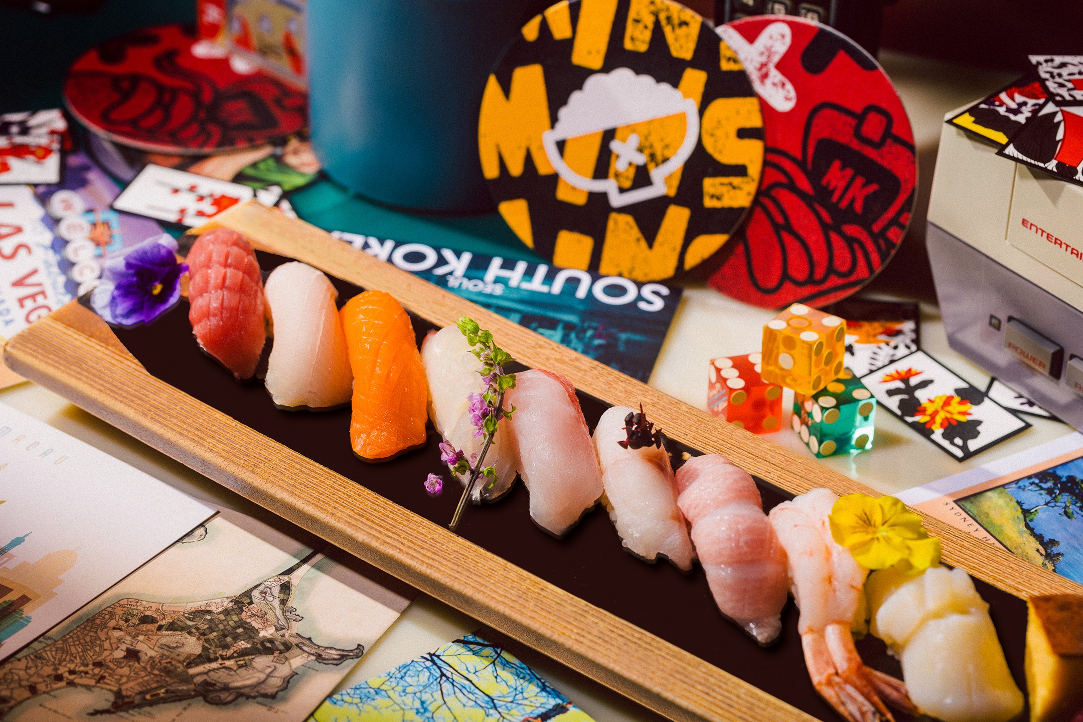
The graphic elements accompany the logo, denote the playful nature of the pop-up (a stylistic departure from the fine dining concept of Mizumi) and illustrate the range of available offerings.
Art Direction
Visual Identity
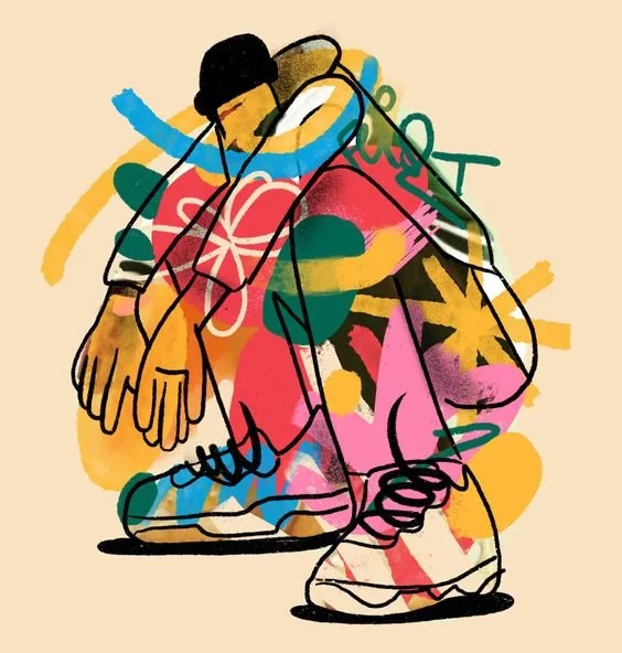
Illustration
Typography
Print Design
Saisunee P.
Illustration & Design
Donovan T.
Motion Design
ŌKAMI Collective
Photo & Video
Services
2023
Credits
MOOD + typography + color
MOOD // These images are collected from multiple moodboards during the initial pop-up ideation. The project’s deadline is tight, resulting in a shorter concepting stage. While the overall vision isn’t apparent quite yet, some of these photos guide the overall direction for the food & beverage photography and collateral design.
Influencing the overall vision are additional themes from Chef Min Kim, encompassing elements of streetwear/fashion, art, music, and anime.


TYPOGRAPHY // The san-serif typefaces that range in weight and style create a bold juxtaposition in relation to each other, as well as the pop-up in contrast with Mizumi.

Degular display
by oh no. type co.
headings

MOTOR-NORMAL
by EuropaType
subheadings

Roboto Mono
by Google
body, captions

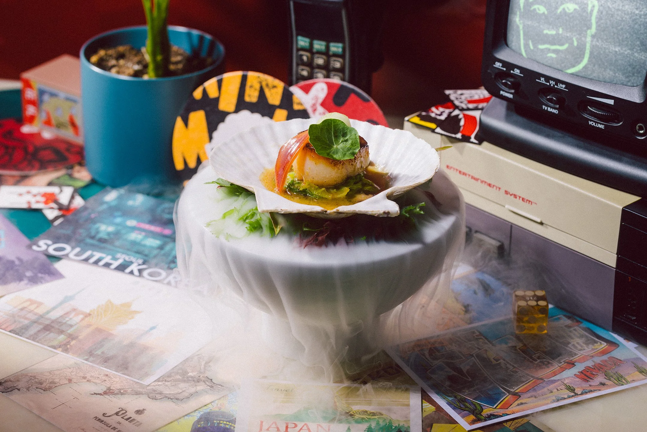
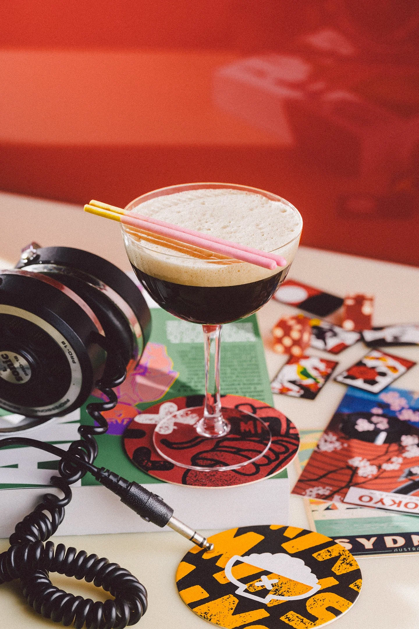
COLOR // The colors draw inspiration from the pop-up’s culinary and cultural fusion, alongside the existing interior of Jardin, the venue where it all takes shape.

WASABI
#6dd665

miso
#ffb83b

gochujang
#dd4746

black sesame
#000000


collateral + marketing
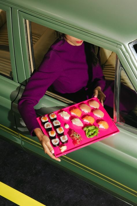
At Wynn, hosting the inaugural pop-up of its kind, the emphasis rested on creating a bold and attention-grabbing appearance. While the primary marketing objective is to captivate, an added emphasis lay in conveying Chef Min’s personality through every piece.
Collateral items, including menus, posters, staff uniforms, and coasters, acted as a driving force in the spatial transformation of jardin by day into MTK at night.


